Haunted Example #1:
You create a multiple-select question when participants should only select one answer option. |
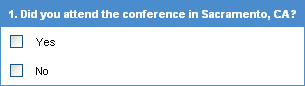
A multiple-select question
|
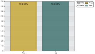 As
a result, participants are able to select both answer options
and it’s unclear in the report which percentage of respondents
did or did not attend the conference. INSTEAD: Select
the Radio-button Question. As
a result, participants are able to select both answer options
and it’s unclear in the report which percentage of respondents
did or did not attend the conference. INSTEAD: Select
the Radio-button Question.
|
Ghoulish Example #2:
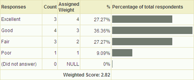
You create a radio-button question when you need a weighted average in the reporting process.
|
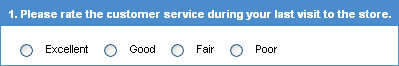
A radio-button question
 |
 REMEMBER:
A weighted average is produced when a weight (number) is assigned to
each answer option. The weights are calculated in the reporting process to
obtain a weighted average. |
ACTUAL RESULT: This report does not contain a weighted average.
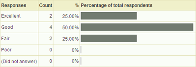
|
DESIRED RESULT: This report contains a weighted average. Use the Rating Question to calculate a weighted average in the reporting process.
|
Gory Example #3:
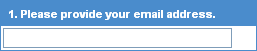
You want participants to provide their email addresses and provide a General Text Box to enter the information.
|
A general text-box question
|
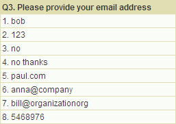 As a result, the report does not display properly formatted email addresses.
INSTEAD: Use the Email Text-box question type. Participants will be required to enter an address with “@” and “.” symbols.
As a result, the report does not display properly formatted email addresses.
INSTEAD: Use the Email Text-box question type. Participants will be required to enter an address with “@” and “.” symbols.
|
Scary Example #4:
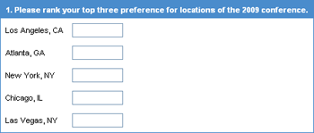
You would like participants to rank their top three preferences and provide a Numeric Allocation question.
|
A numeric allocation question
|
REMEMBER:
A Numeric Allocation question allows the respondent to
enter numeric values and display a total. |
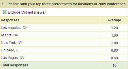
As a result, the report provides averages and does not rank the
questions as desired.
INSTEAD: Select the Ranking Question to understand participant
preferences.
|